

Starmer shouldn't give a conference speech – he should give an Apple-style keynote
The format is tired and it is time to think different.

POD! On The Abundance Agenda this week we talk about how the government has published a new document that appears to be a NIMBY charter – plus we speak to YouTuber CityEd about how to build liveable cities and what London should steal from the Netherlands. [Apple] [Spotify] [Substack] [YouTube]
Tomorrow Keir Starmer will deliver his conference speech – so I thought I’d share this post again from about a month ago! Don’t worry, something new will be landing later this week. But for now, enjoy this!
In TV, it’s taken as a given that eventually even the most successful formats will begin to feel tired.
Think about how back in the day, Who Wants To Be A Millionaire? and Big Brother dominated the cultural zeitgeist and were watched by tens of millions of people. But over the years interest in both has dwindled – and not just because the prize money on the former could barely buy you a semi-detached house in London today.
However, there is something a smart producer can do to liven up a dying show: they can change the format. They can add a new lifeline, or introduce a housemate. Or how about a celebrity special? The important thing is just to try something new to reignite the interest of the general public.
This brings me to Labour Party Conference.
Tomorrow, Keir Starmer will once again take to the stage at the ACC in Liverpool to deliver a speech designed to capture the nation’s attention and drive his government’s agenda.
Traditionally, this has always been a big moment for a party leader. It’s a rare opportunity for the leader to speak at length to the country, without a hectoring journalist trying to cut them off. And it’s seen as a moment to set a narrative that will carry the government for the next year.
But in reality, outside of Westminster, the impact is likely to be limited. Conference polling bounces aren’t as reliable as they once were, because both politics and attention are so fragmented. And even if it turns out Barack Obama himself has been personally training Keir Starmer in the art of public speaking, it is unlikely that the speech will close the gap with Reform.
In any case, the speech itself will probably be seen in full by – at most – a million retired people watching Politics Live. And if the government is lucky, maybe a few million more will see brief clips either on the news or on social media.
But ultimately, even if people watch, it will still be the same old thing: a boring politician, standing behind a lectern. And this will be despite two decades of dramatic change in how we engage with the news, how the media is structured, and how our attention is captured.
In other words, it is obvious now that the format has grown stale, and it is time to reinvent it.
And don’t get me wrong, I’m not just doing theatre criticism here. It’s because a traditional speech no longer serves a strategic purpose.
The fundamental challenge for Labour from a communications perspective is how to reach people who are disengaged, who would never seek out political content, and persuade them to like Keir Starmer.
In other words, the goal of the speech should not be to capture newspaper headlines. It should be to go viral. And to do this, it requires switching up the format – and trying something new.
Now don’t get me wrong. I’m not suggesting that Starmer should do away with the speech and instead make a video of himself trying unusual American snacks, performing TikTok dances or compiling a tier-list of his favourite cabinet ministers.
But I do think there is a model for a presentation that works better in the modern era. It’s time for Labour to learn from Apple.
If you enjoy nerdy politics and policy takes, then make sure you subscribe (for free!) to get my newsletter in your inbox.
The Apple upgrade
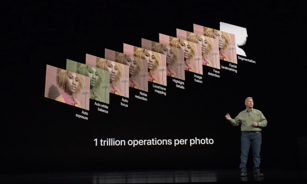
Every September, just before party conference season kicks off, Apple holds a major “keynote” event to announce a new iPhone.
These events are a masterclass of communication and storytelling. Each year, the new iPhone is never massively different to what came before, but by the end of the hour or so, you’ll believe you can’t possibly live without the slightly larger screen, or the new camera button on the side.
Over the years, the company has become increasingly slick at performing these rollouts. Though my favourite is still this old clip of Steve Jobs, introducing the iPhone for the first time in 2007.
In the video, before revealing the iPhone, Jobs tells a compelling story, explaining how existing phones are hard to use and are underpowered – and he reveals that his company has invented three new devices: a touchscreen iPod, a revolutionary new phone and an “internet communications” device – which, by the way, happen to be the same device. And then the crowd goes wild.
And I think first of all, on a purely superficial level, there are several things that Keir Starmer and the Labour Party can learn from this.
1. Use a screen!
If there’s one single takeaway from this piece, I want it to be: use a screen! It’s crazy that we’ve had the ability to project images behind a speaker for literally decades now, and still politicians do not take advantage of this.
Obviously we’ve all sat through terrible PowerPoint presentations over the years, but they don’t have to be terrible – and can be a great aid for storytelling, as everyone from Dave Gorman to TED can evidence.
So why not let the Prime Minister use a screen too? When talking about improvements to the NHS, he could literally show a graph – similar to how Apple will pick key metrics, and then visualise them for the audience.
Similarly, why does a speech have to be just a ‘speech’ – a boring man talking? Instead of hackneyed “I met a woman when visiting a factory…” stories, just show us the factory!
Graphics and images would give the speech some momentum, and help elevate the words being said, even if they are just wallpaper. I’m not a great speaker, but I am pretty good at a Powerpoint – I’ll pack in dozens of slides, knowing that when I click “next”, each is like a jolt to get the audience’s attention again.
2. Branded functionality
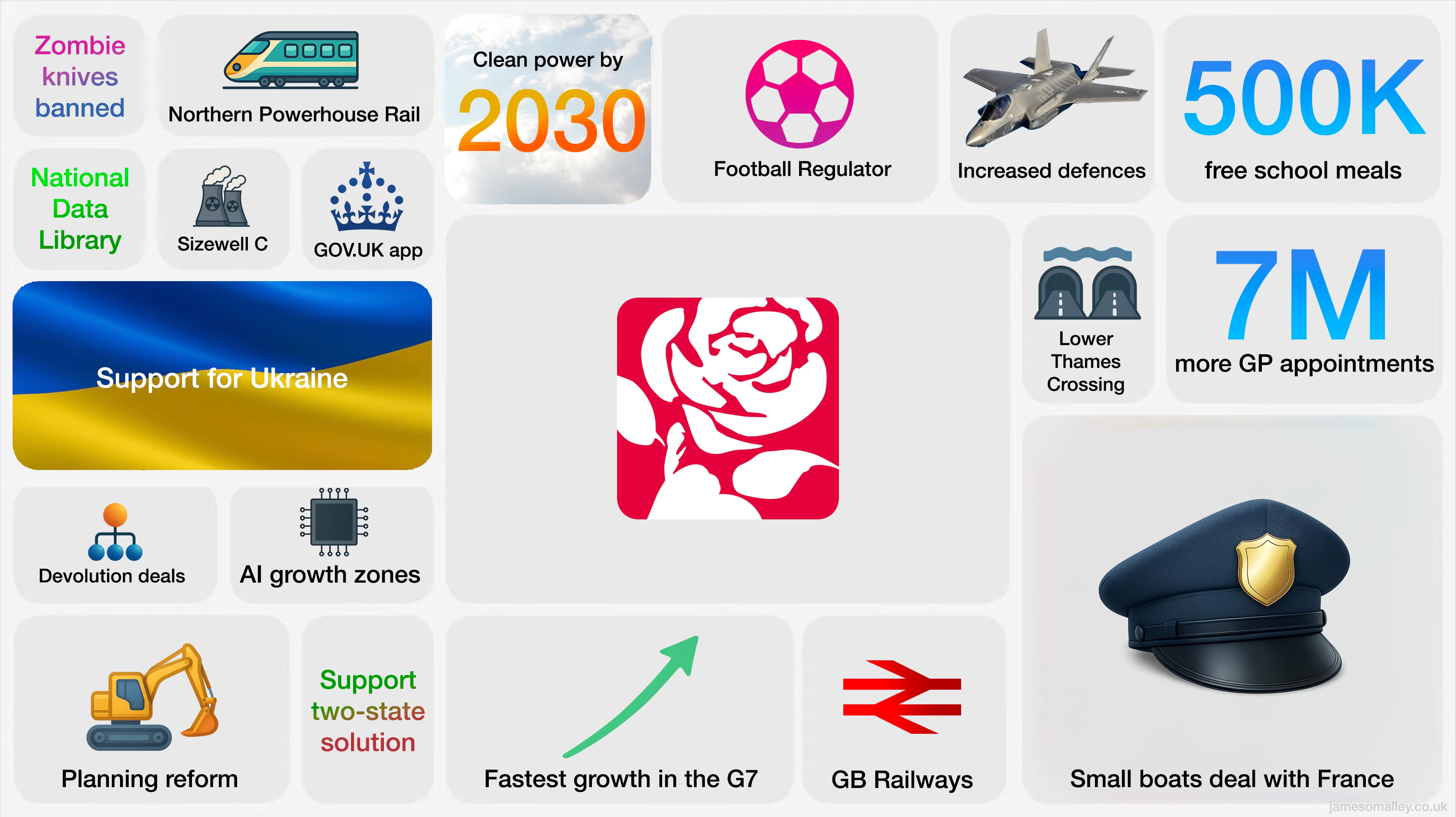
One trick that Apple uses effectively is branding, not just for its devices – but for individual functions. For example, iPhones don’t just have screens that refresh at 120Hz – they have “ProMotion” displays. And the latest Mac chips are not just some internal codename – they are branded “M1”, “M2”, and so on, so that when the M4 MacBook is released, suddenly your M3 starts to feel a little old.1
And what it means is that when Apple reveals a new product, it can trumpet the features like this:
I think it would be incredibly effective if Keir Starmer were to do something similar for all of the policies and programmes he talks about in the conference speech. The brands would provide a visual hook that will make the policies more legible and memorable to voters.
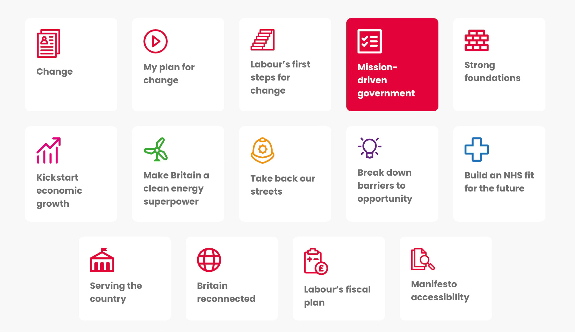
And to be fair, the Labour Party has gestured in this direction. In the 2024 manifesto, each of the missions was given a little symbol to associate with it – but this was more in service of making them feel distinct in the document. My view is that these ‘features’ should become real brands, that persist beyond the conference speech, and become visual signifiers that are present every time that policy or programme is relevant to whatever is being discussed. This is what I’ve mocked up in the graphic at the top of this piece.
3. Remember it’s a TV production
The third thing that Apple knows is that, ultimately, the keynote is a TV production.
That’s why in recent years, Apple has eschewed the stage entirely and now announces new phones and computers in slickly produced videos2 – though they still follow roughly the same format.
I think the lesson for Starmer is that instead of giving a speech, he should think of the presentation more like making a TV show. And this means that aside from graphics, it’s okay to do what Apple CEO Tim Cook does, and hand over to other executives for moments of focus, or to cut to short videos to visualise new features.
So why not hand over to Bridget Phillipson to talk about how the government is going to improve results for working-class kids? Or to a video of Wes Streeting in a hospital, to explain how AI is going to allow doctors to spend more time with patients?
Hell, you could even bring on guests. Why shouldn’t the Prime Minister invite the Rolls-Royce CEO to endorse the government’s Small Modular Reactor plans? Or have Jason Manford appear in a skit that demonstrates the powers of the new football regulator?
Solutions not values
So far I’ve only spoken about some pretty superficial changes to what the conference speech should be. But I do think that, below the surface, there is something much deeper that needs to change – especially now the government is well established and actually making things happen.
Take a look at last year’s conference speech, which was made just a few months into the current government taking office. As a traditional speech, it was completely fine, even if I can’t remember any specific lines from it now.
But what is striking is how heavy it is on statements of values – the argument the speech was making was how Starmer was leading a “government of service”, in contrast to the last lot.
As such, most of the policy content was little more than a word and an exclamation mark. For example, he gives a big list of Labour’s policy goals – “new solar projects”, “more teachers” and so on. Which works as traditional politician speechifying – but doesn’t actually explain anything to people watching at home.
I think this is where Apple offers a new approach. Because Apple doesn’t just say “better camera” – instead, the company takes the time to explain why the new camera is better.
Focusing on values makes sense when you’re new – and when you need to detoxify and distance your party from what came before. But sharing values with voters is not any use, if you can’t demonstrate how you’re going to improve their lives – and to be credible, that means explaining it with more than an exclamation mark.
So something I’d love to see is Starmer actually take the time to demonstrate how his policies are fixing Britain.
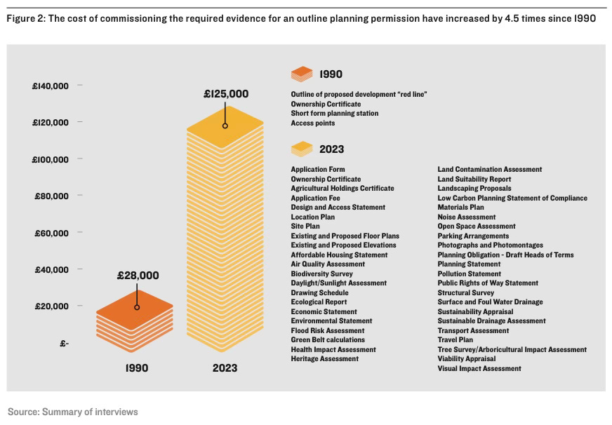
Take planning, to choose an obvious example. Why not show a visual of how the amount of paperwork has inflated in planning applications since the 1990s – and talk about how the government is reducing it?
Or why not show a graph of how renewable energy approvals have hit a new record?
Sure, by the old rules of politics, the Prime Minister getting in the weeds of policy in this way, in a major speech would be seen as a misstep. That’s why conference speeches are so bland – they are not designed to be engaging, they are more an exercise in stakeholder management, ensuring the different interests and factions in the party receive their shout-outs, and for drawing primary-coloured ideological contrasts with the other parties.
But this is old-world thinking. If the government wants to reach people, it needs to produce compelling content – not just repeat some catchphrases and say “us good, them bad”.
This is where we get to my riskiest claim. I genuinely think that doing something bold, like performing an Apple-style keynote could pay off. I think the first high-profile politician to do it will be hailed as a political genius, and may even go viral, as they will be connecting in a new way with voters.
And most importantly, it would fit in better with how people actually consume content in the modern age.
For example, podcasts and much of YouTube disprove the theory that what people want is video that is shorter or less detailed. Perhaps people would be interested to see the Prime Minister, long-form, explaining his ideas and his policies, in something that doesn’t look like a boring speech? I mean, 24 million people have watched this 1hr42m video about the Disney World queuing system.
And even if only weirdos like readers of this Substack would watch the whole thing, in any case, such a keynote would create ample opportunities for positive vignettes to be remixed and repurposed as TikToks and Reels and so on. If all TikTokers see is a boring man standing behind a lectern, they’re going to flick away before Starmer has even said the word “Britain” in “Renew Britain”.
One more thing…
I’m sure at this point, any political communications professionals reading will be tearing their hair out.
And I admit, perhaps the approach I sketch out here might be disastrous. But it also might not be. It’s currently an untested idea.
I also concede that values still matter. It’s important to signal that you share the same values as voters – the Corbyn experiment tested the alternative hypothesis to destruction.
There are many other criticisms of this proposed approach you could make too.3
But fundamentally, I also think it is important for Starmer to try and explain what he’s done, and what he is still planning to do. After all, current polling and a summer of ugly headlines have shown the limitations of cosplaying Nigel Farage on values.4
Sometimes you have to appeal to the head, and not just the heart.
And a better way to do this is not to stand behind a lectern and talk like politicians have done for decades. It’s time to reboot, refresh and modernise the format. And it’s time to learn from Apple, and produce a keynote – with a screen – that works for the modern world.
Enjoyed reading this? Then make sure you subscribe (for free!) to get more takes direct to your inbox.
And please consider sharing it!
And follow me on Bluesky!
The most shameless branding though is surely how Apple spins punching a big, ugly black bar into the top of your screen where the camera and speaker goes. It calls it the “dynamic island” on the latest iPhones – and make it sound like a feature, rather than an annoying necessity.
Amusingly the company spent a reported $179m on a special theatre for live keynotes, shortly before the pandemics and the switch to video presentations. Good job it can afford it.
I can already think of a bunch of objections: It wouldn’t look ‘Prime Ministerial’, whatever that means after the tenures of Boris Johnson and Liz Truss. Traditionally, broadcasters refuse to play in party conference videos, so there would be a logistics issue there. Wouldn’t inviting other Ministers to do a turn create a patronage minefield? What about all of the extremely tedious bits of the normal speech where the leader has to mention the pet issues of different factions, to keep everyone on side? And wouldn’t the traditional press give the government hell for trying to go around their iron grip on access?
The lesson of Brexit was that “head” does not always win over “heart”… but that doesn’t mean that “heart” always wins.
Speaking as someone with a fairly peripheral interest in politics, but a well grounded, deep fear of a potential reform government, this sounds like an excellent idea.
As a marketing person I approve James’ message. Ideally PowerPoint screens should have a slightly unusual image (ie not a stock shot of a factory, but one from an unusual angle, or with a lateral connection) to grab attention and signal another phase of the talk, and with a bare minimum of text (7 words or less, or the audience is just reading while you’re talking and then switching off)…