

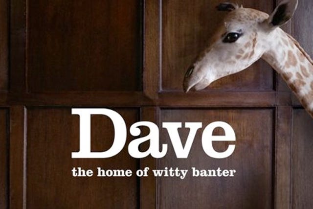
What the NHS can learn from Dave
On branding, legibility and how to communicate change.

POD! Don’t forget to check out this week’s episode of The Abundance Agenda, where we dig into what went wrong with HS2, the downstream consequences of autonomous cars – and talk to technologist Tom Forth about his ideas for the National Data Library. Listen on Apple, Spotify or Substack.
I was an extremely popular and cool teenager, so when I wasn’t fending off romantic overtures from my female peers, I spent a lot of time reading about the branding and identities of TV channels on websites like The TV Room.
It sounds strange, but there was a surprisingly large community of people who cared about this stuff – who would obsess over interstitials and other graphics that were shown between shows, like the classic BBC Two “2” idents.
The aspect of ‘TV Pres’ (as we cool kidz called it) that particularly fascinated me though was that every few years when channels inevitably rebranded, they always had to make a choice: Do they choose an identity which marks them out as distinct, or do they go for something much more unified, to signal that they are a part of a larger network of channels?
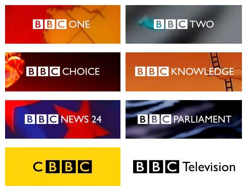
You don’t have to dig too deep into TV history to see this tension in action. The BBC did it, with successive rebrands bringing channels into line with consistent fonts and styles, followed a few years later by a new set of graphics that would break the consistency.
My favourite example of this phenomenon though was on Sky, which operated many more channels, and seemingly made a point of completely refreshing their graphics with the same regularity as the rest of us changing the batteries in our smoke alarms.
For example, in 1995, the pendulum swung towards consistency, as Sky adopted a consistent “tower” motif and shared font across its entire portfolio.
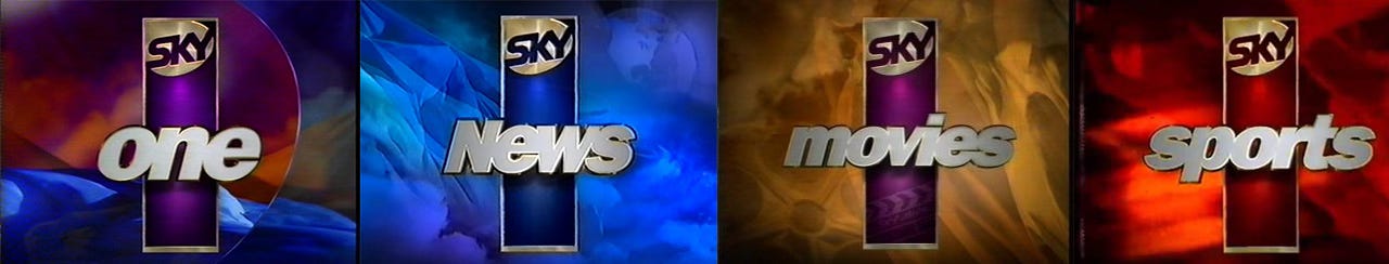
But the uniformity wouldn’t last. If you look at the graphic below, you can see how over the years the logo used by Sky’s flagship channel, Sky One, wildly fluctuated between strikingly distinctive (eg, 1998-2004), and being pulled back in line with its sister channels (eg, 2011 onwards).1
Keep reading with a 7-day free trial
Subscribe to Odds and Ends of History to keep reading this post and get 7 days of free access to the full post archives.